Overview
No central place to share what your organization knows
Ninety.io lacked a centralized solution for teams to share internal knowledge, onboarding content, and coaching resources. Before the Knowledge Portal, teams used fragmented tools — Slack, Google Docs, email — to share critical information. There was no way to ensure people had access to the right content, track engagement or completion, or curate reusable knowledge artifacts across teams.
I led the design and execution of the Knowledge Sharing Tool (KST) — an extensible learning platform built to help organizations document, assign, and track learning materials — from scratch through alpha, beta, and GA, continuously evolving it based on user feedback and behavioral data.
The Problem
Critical knowledge was scattered and untrackable
The absence of a centralized tool created three compounding problems for Ninety organizations:
“We needed a centralized tool that could organize content clearly across roles and teams, track completion and assignment, and scale with growing organizations.”
Research & Discovery
Interviews, journey maps, and flow mapping
I ran interviews with internal teams, coaches, and clients to understand knowledge-sharing pain points. Key insights validated the problem scope: managers struggled to onboard consistently, coaches wanted a way to assign post-session content, and users needed role-based filtering to find what was relevant to them.
I created user journey maps for both Admin and Learner archetypes — visualizing their motivations, friction points, and success paths. These flows clarified product requirements and gave the cross-functional team (PM, two engineers, and a second designer) a shared lens for evaluating UX tradeoffs.
I also mapped the full content creation and assignment journey — from Knowledge Share to Rock and To-Do creation — which clarified dependencies across tools and uncovered opportunities to streamline the user path and reduce redundant steps.
User testing rounds
We ran multiple rounds of moderated usability tests focused on three areas where early designs had the most ambiguity:
Key Design Decisions
Three decisions that defined the product
The sequencing decision that shaped the MVP: we postponed “content analytics” and “draft modes” until we validated real-world use. Scoping tightly meant we shipped faster and learned from actual behavior rather than designing for hypothetical needs.
Outcome
Every target KPI exceeded in 90 days
AI Iteration
The barrier wasn’t the tool — it was the blank page
After launch, adoption data and follow-up user interviews revealed a specific friction point: users understood why the Knowledge Portal was useful, but many stalled at the very first step — creating a new Collection. The problem wasn’t discoverability or navigation. It was the blank page.
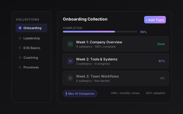
I led the design of a Maz AI companion that guides users step-by-step through creating their first Collection. Maz uses a conversational flow to break the process into approachable questions, helping users go from a blank page to a fully structured Collection in under 10 minutes.
By directly targeting the first-session barrier, the AI companion improved first-session success rates and increased overall engagement with the Knowledge Portal. This follow-up iteration demonstrated a pattern I’ve carried into subsequent AI work: the best place to introduce AI is at the exact moment a user is most likely to give up.
This is the same human-in-the-loop insight that shaped my work on Maz for goal-setting (Draft Rocks) and on the AI Assistant at Constant Contact: AI earns trust not by doing everything, but by showing up at the right moment with the right amount of help. The Knowledge Portal intervention was where I first validated that framing in production.
Reflection
What this taught me about 0→1 product design
Giving admins too many open-ended content tools led to messy hierarchies in beta. Preset templates and scoped roles helped without removing creative control. The right amount of structure is whatever prevents the most common mistake without feeling restrictive to the users who don’t make it.
Simply adding % completion shifted usage patterns measurably. Visibility of progress isn’t just a UI nicety — it changes how people engage with content and how managers maintain accountability.
Postponing content analytics and draft modes until we had real-world validation was the right call. The AI companion iteration wouldn’t have been possible without the behavioral data we collected in those first 90 days — we needed to see exactly where users stalled before we could design the right intervention.