Overview
A help panel that was quietly helping users leave
On the Customer Happiness Squad at Constant Contact, I’m leading design on a retention-focused initiative targeting churn across the existing customer base — partnering with a senior product manager and grounding every decision in behavioral data.
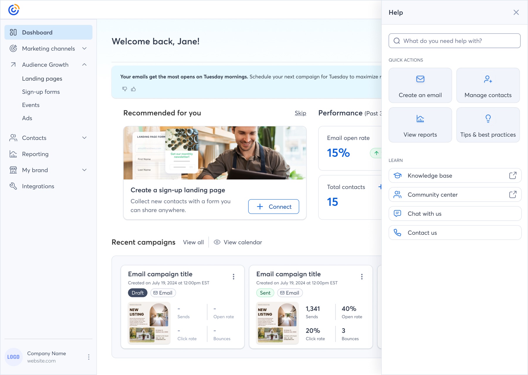
The starting insight was uncomfortable: the product’s in-app help panel — the surface users turn to at their most decisive moments — was optimized for helping users cancel rather than reconsider. When someone searched “cancel,” the cancel article was the most prominent result. The pause option was buried. There were no alternatives, no value reinforcement, no recognition of the user’s situation.
This case study covers the data analysis, journey mapping, and milestone-based design strategy I’m using to turn that surface into a retention engine — with a roadmap that ends in AI-powered, conversational retention.
The Problem
Over half the active base sits in at-risk segments
Cohort segmentation revealed that three at-risk segments make up more than 51% of the active base. Two stood out as the highest-priority targets:
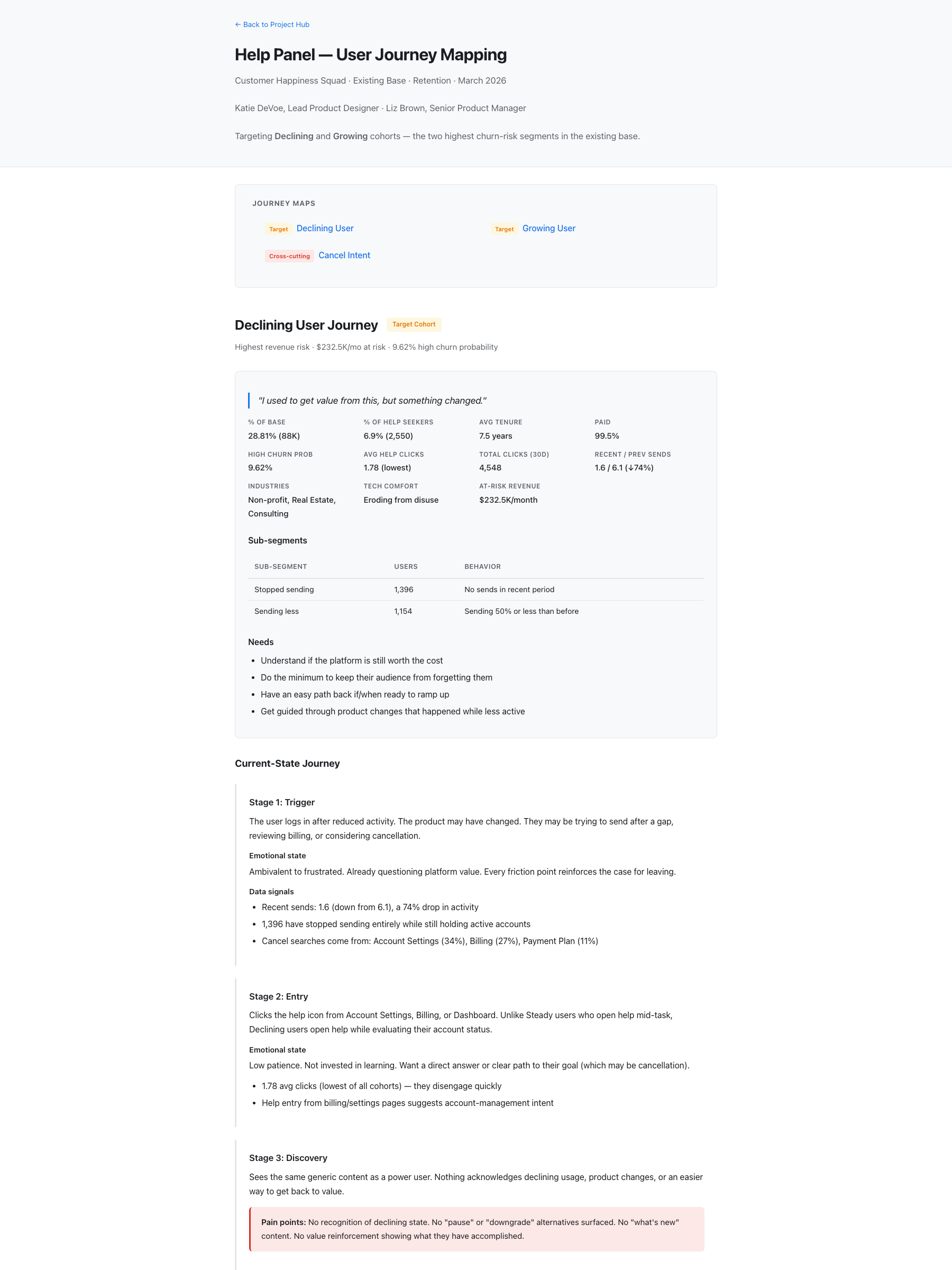
Long-tenured customers whose sending has dropped 74%. Nearly 1,400 have stopped sending entirely while still paying. Their mindset: “I used to get value from this, but something changed.” They open help with the lowest click engagement of any cohort — and the panel offers no recognition of their situation, no “what’s new,” no easy path back.
The most engaged help seekers (2.51 average clicks — the highest), actively expanding into automation, SMS, and landing pages. Their mindset: “Figure out what works. Let me try different campaign types.” But the help content has no progressive learning paths, no feature recommendations, and no “why” or “when” context — so they stall at exactly the moment they should be sticking.
Cutting across both cohorts is the cancel-intent moment: 2,883 users searched “cancel” in 90 days. They average 6.6 years of tenure — these are not impulsive users. And 47.3% of them end up staying, which means nearly half are persuadable. The help panel just isn’t doing the persuading.
Research Approach
Behavioral data first, then journeys built on top of it
Rather than starting from assumptions or stakeholder anecdotes, I built the case from product analytics — querying help panel behavior, cohort segmentation, and churn outcomes directly from the data warehouse (Snowflake, with Claude as an analysis partner). That produced a foundation no one could argue with:
“Help and support usage is nearly identical between retained and canceled users. The current help panel is equally ineffective for both — which means any improvement is untapped territory.”
I paired the quantitative work with competitive benchmarking, which showed that proven retention patterns — pause options, reason-based routing, graduated offramps — are standard elsewhere and simply absent from our experience.
Journey Mapping
Three journeys, one shared spine
I mapped three current-state journeys — Declining, Growing, and the cross-cutting Cancel Intent journey — each through the same six-stage lens: trigger, entry, discovery, engagement, resolution, and outcome. Using a shared spine made the cohorts directly comparable and let every stage pair an emotional state with the data signals behind it.
The cancel-intent journey became the centerpiece, because it has the clearest baseline (52.7% churn), a measurable population, and the highest single-moment revenue impact. Stage by stage, it documents how the experience fails:
Key Findings
The findings that reframed the conversation
Together, these moved the framing from “the help panel needs better content” to “the cancel moment is the highest-leverage retention surface in the product, and we’re forfeiting it.” Help panel users also demonstrate substantially higher lifetime value than the base — making this surface disproportionately worth investing in.
Design Response
A graduated offramp instead of a binary choice
The core design principle: cancellation should be the last step of a graduated flow, not the first result of a search. Today the user’s choice is binary — cancel or give up looking. The redesigned experience introduces a sequence of lower-commitment alternatives, each surfaced with respect for the user’s intent:
For users who stay, the design pairs the offramp with value reinforcement — personalized summaries like “Over 6 years, you’ve sent X campaigns to Y contacts” — and for Declining users, “getting back on track” content with a low-effort “send a quick campaign” path back to value. Search disambiguation also separates “cancel my account” from “cancel an automation,” which currently pollutes the signal.
Milestone Roadmap
Three milestones, ending in conversational AI retention
I structured the design strategy as three shippable milestones, each valuable on its own and each laying groundwork for the next. This let leadership fund the work incrementally rather than betting on one big redesign — and it connects directly to the AI Assistant initiative I design for elsewhere in the product.
Surface pause, downgrade, and specialist options alongside the cancel article. Add “before you cancel” framing inside the article itself. Disambiguate cancel searches. Remove dead ends so every article has a clear next step. Target: pause visibility from 3% to 15%+, and a measurable dent in the 18% who close the panel without acting.
Detect cancel-intent signals and declining-usage patterns, and adapt the experience: personalized value summaries, plan right-sizing, the full graduated retention flow, and re-engagement triggers for paused accounts. For Growing users, learning paths, feature recommendations tied to their usage, and success-metric motivation (“Your open rate is 45% — segmentation can improve it”).
The AI Assistant detects cancel intent from behavior before the search happens, opens a soft conversation without assuming intent, negotiates alternatives (plan adjustments, trials, specialist calls), and hands off to a retention specialist with full context instead of a cold ticket — then follows up afterward. This is where the help panel work and my AI Assistant work converge.
Business Case
Modeling the revenue, not just the experience
To fund the roadmap, I built the leadership case in revenue terms. The analyzed cancel cohort loses $39.8K/month in canceled subscriptions against $70.8K/month retained. Modeling churn-rate improvements against the full cancel-searching population:
These are deliberately conservative, scoped only to the directly measurable cancel cohort — they exclude the $232.5K/month at risk in the broader Declining segment, where re-engagement interventions compound the upside. Framing design work this way changed the conversation from “UX cleanup” to a funded retention initiative.
Measurement
Every intervention has a number attached
Because the baseline analysis was so granular, each milestone ships with success metrics already defined — baseline and target, per cohort:
Status & What’s Next
Where the work stands
The research, journey maps, UX audit, competitive benchmarking, and leadership data deck are complete. Interactive M1 prototypes for desktop and mobile are built and in front of stakeholders. Next:
Reflection
What this work is teaching me
Data made the design argument unanswerable
The single most effective move in this project wasn’t a screen — it was querying the churn data myself before proposing anything. When you can say “only 3% of cancel searchers ever see the pause option, and the 47% who stay pay twice as much as the ones who leave,” the design conversation changes. Nobody debates whether the problem is real; they debate how fast we can ship the fix.
I’m also learning that retention design is fundamentally about respecting user intent while widening their options. The goal is never to hide the cancel button — dark patterns would poison the exact trust this initiative depends on. It’s to make sure a 7-year customer having a hard month sees a pause button before a cancel button, and a human before a dead end.
And structurally, milestone-based roadmaps are how design strategy survives contact with funding cycles. Three independently shippable milestones got a yes that one monolithic redesign never would have.